
If you’re planning to refresh your interiors this year, you’re in luck—2025’s colour trends are all about comfort, calm, and connection to nature. Whether you’re styling a coastal bach in Ruakākā or renovating a family home in Maunu, there’s something in this year’s colour palette for every Whangārei home.
We’re seeing a shift away from stark whites and greys toward softer, earthier, more soothing tones. Think warm neutrals, muted greens, natural textures, and a splash of moody depth where it counts. But it’s not just about what looks good—it’s also about how your home feels. And with our relaxed Northland lifestyle, that matters.
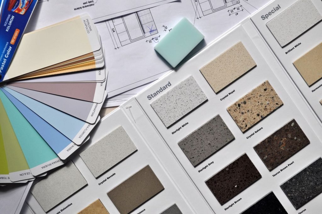
Let’s take a look at the interior colour trends making waves in Whangārei for 2025.
Nature-inspired colours take centre stage
Here in Whangārei, we’re surrounded by natural beauty—beaches, bushland, open skies—and this year’s colour trends are reflecting exactly that. One of the biggest shifts is towards colours that mimic our local environment. Think mossy greens, sandy taupes, soft clay tones, and ocean blues.
These colours work beautifully with our coastal light and are ideal for homes that want to feel grounded, calm, and connected to nature.
Some popular picks include:
Resene Spanish White – a warm, creamy neutral that pairs well with timber and greenery.
Dulux Reefton – a soft olive green that brings a tranquil, earthy vibe to living spaces.
Resene Duck Egg Blue – subtle and breezy, perfect for bedrooms or bathrooms.
Dulux Waitangi Clay – a warm, muted terracotta that adds character without overpowering.
These tones are versatile and can be layered with natural materials like wood, linen, and stone for that modern coastal-lifestyle look.
Warm neutrals are the new white
If you’ve painted your walls white in the past, you’re not alone—white has been a go-to for years. But in 2025, we’re moving toward warmer, more comforting shades that still keep spaces feeling light and fresh, but with a little more soul.
Soft creams, buttery beiges, and warm greys are replacing the cooler tones of past years. These shades are ideal if you want a clean look that doesn’t feel sterile. Plus, they’re incredibly forgiving with dust, smudges, and everyday wear—perfect for family homes.
Try shades like:
Resene Rice Cake – a slightly creamy off-white that still feels bright and airy.
Dulux Haast Half – a warm, modern greige (grey-beige) that works with almost any décor.
Resene Quarter Thorndon Cream – classic, soft and inviting—especially in older character homes.
Warm neutrals work across every room in the house and make an excellent backdrop if you want to bring in colour through furniture, art, or rugs.
Muted blues and soft greys for a calming effect
Coastal homes call for calming spaces—and nothing says “relax” quite like soft blues and subtle greys. These colours remain popular in 2025, especially in bedrooms, bathrooms, and lounge areas where a serene atmosphere is key.
Unlike the stark greys of years past, we’re seeing softer, dustier tones that are easier to live with and feel more natural. The right blue or grey can make a space feel bigger, cooler (great for hot Northland summers), and more peaceful.
Try these:
Dulux Ōkarito – a soft, misty grey-blue that’s ideal for quiet, restful spaces.
Resene Casper – a muted, silvery blue that suits both modern and coastal interiors.
Dulux Light Grey Friars Half – gentle, sophisticated, and perfect for open-plan areas.
Pair these shades with natural textures—think wool throws, linen curtains, and timber flooring—to keep the look grounded and inviting.
Accent walls and feature colours are back (but subtle)
Gone are the days of dramatic red feature walls. In 2025, accent walls are making a comeback—but in much more understated, elegant ways. Homeowners in Whangārei are opting for darker, earthy tones to create depth without overwhelming the space.
These accent colours work great behind a bedhead, in a reading nook, or in a formal dining space. When used sparingly, they can make a room feel more layered and thoughtful.
Some trending feature colours:
Resene Nocturnal – a deep navy with grey undertones, perfect for cosy spaces.
Dulux Tekapo – a moody green-blue that mimics Northland’s coastal water.
Resene Rocky Point – a rich charcoal with earthy depth—great for contrast in neutral rooms.
If you’re nervous about committing to a bold wall, try using these colours on cabinetry, window trims, or even a ceiling for something unique but subtle.
Earthy textures and natural materials pair beautifully
It’s not just about paint colours—it’s also how you bring the whole space together. This year, the interior design trend across Whangārei homes is leaning heavily into organic, tactile finishes.
We’re talking natural timber, woven textures, raw ceramics, stone finishes, and textiles like jute, linen, and cotton. These elements combine beautifully with the colour palettes mentioned above to create a look that’s both modern and relaxed.
So if you’re repainting, think beyond the walls. Choose colours that complement the textures in your space and bring out the warmth of your natural materials.
Colour zoning for open-plan homes
Many modern homes in Whangārei have open-plan layouts, which is great for flow—but can sometimes feel like one big room. That’s where colour zoning comes in. It’s a clever way to use slightly different shades or tones in each area to visually divide spaces while keeping the overall look cohesive.
For example, you might use a light warm neutral in the kitchen and dining space, and shift to a muted green or soft blue in the lounge area. This creates a subtle sense of separation without using physical walls or dividers.
It’s a great strategy for adding interest and functionality to your home without making it feel cluttered or disconnected.
Let Whangārei light guide your colour choice
Northland’s natural light is something special—but it also means colours can look very different once they’re on your walls. Our sunlight is bright, clear, and can wash out pale tones or make bold ones seem much stronger.
That’s why we always recommend testing your chosen colours with brush-outs on different walls at different times of day. What looks warm and cosy in the evening might look flat or cool at noon. Take the time to live with the sample for a few days before you commit.
Need help choosing? We’re happy to guide you through samples and even visit your home to see how the light works in each room.
Final thoughts – keep it relaxed, keep it you
2025’s interior colour trends are all about warmth, ease, and creating spaces that feel truly livable. For Whangārei homeowners, that means embracing our coastal lifestyle, working with the natural light, and choosing colours that bring a sense of calm and connection to the spaces we spend the most time in.
Whether you’re updating a single room or planning a full-home refresh, the key is to choose colours that feel good to you—not just what’s trending on Instagram. And if you’re unsure where to start, we’re here to help.
Need expert advice, samples, or a quote for interior painting? Give us a call—we’re local, experienced, and always happy to talk colours.
